Improving Free-to-Paid conversion by designing the first onboarding flow
1.1 million verified users, but only 1 in 5 new sign-ups ever upgraded to a paid plan. As the sole Product Designer at Blockpass, I designed the company's first onboarding flow to close that gap.


Please note, this case study is under a Non-disclosure agreement (NDA). The designs shown below are recreated simulations based on my original decisions and do not reveal actual product details.
Introduction & Challenge
Blockpass is a RegTech company providing digital identity verification for the Web3 and crypto ecosystem. At the time of this project, the platform served ~1.1 million verified users and over 3,000 business clients. The numbers looked strong, but the revenue didn't reflect it.
Most users signed up for the free plan and never upgraded. Among returning users active in the past 6 months, only ~30% converted to paid. For new sign-ups, that number dropped to ~20% within their first 2 months. The platform had scale, but nothing turning that scale into revenue.
One designer. Six-plus products. No research budget. That was the reality I worked in. This project was part of Billing V5, a larger initiative to restructure service pricing, and I had 2 months to design the onboarding flow the product had never had.
Design Goals & Metrics
Three goals guided the project:
Increase free-to-paid conversion during onboarding, before users settle into the free plan and lose interest in upgrading.
Build first-impression trust and clarity so new users understand what Blockpass offers and why it matters before they take any action.
Launch early enough to learn. The flow had to go live within the Billing V5 timeline so the team could start collecting behavioral data, like completion and step-by-step drop-off, and iterate on real usage instead of assumptions.
I set the success targets together with the CTO and PM during Billing V5 planning. Here, conversion means the share of each group that upgraded to any paid plan within its time window:
Free-to-paid conversion (returning users, active in the past 6 months): baseline ~30% → target ~45%
Free-to-paid conversion (new users, first 2 months): baseline ~20% → target ~40%
Onboarding completion rate: target ~70%, to make sure the new flow itself didn't add friction or cause users to abandon midway
Step-by-step drop-off rate: diagnostic metric only, to show where users slow down or hesitate for post-launch iteration
The conversion targets were business targets for Billing V5 rather than benchmarked numbers. They were deliberately ambitious: this was the product's first upgrade path, so there was no internal precedent to calibrate against.
The Problem & Research
With no research budget and no time for user interviews, I worked with what I already had: the product itself, the billing dashboard, and whatever I could find on competitor websites. I used the first two to understand what was broken and the third to figure out where to go.
What the product revealed: heuristic evaluation
Blockpass's Admin Console had no onboarding flow. After signing up, users saw a simple welcome screen and were defaulted to the Free plan, with no guidance toward their "Aha Moment."
Auditing the welcome screen
The welcome screen failed on two fronts:
No value proposition. Below the "Welcome to Blockpass" heading, there was nothing telling users what the product does or why it matters. Users had just signed up, but still couldn't answer the most basic question: "What can this product do for me?"
Weak and ambiguous CTA. The primary button labeled "Start" gave no indication of what users would see or gain by clicking. No context, no motivation to continue.
These were compounded by secondary issues: an illustration unrelated to identity verification, and an unnecessary language toggle competing for attention on an already sparse screen.
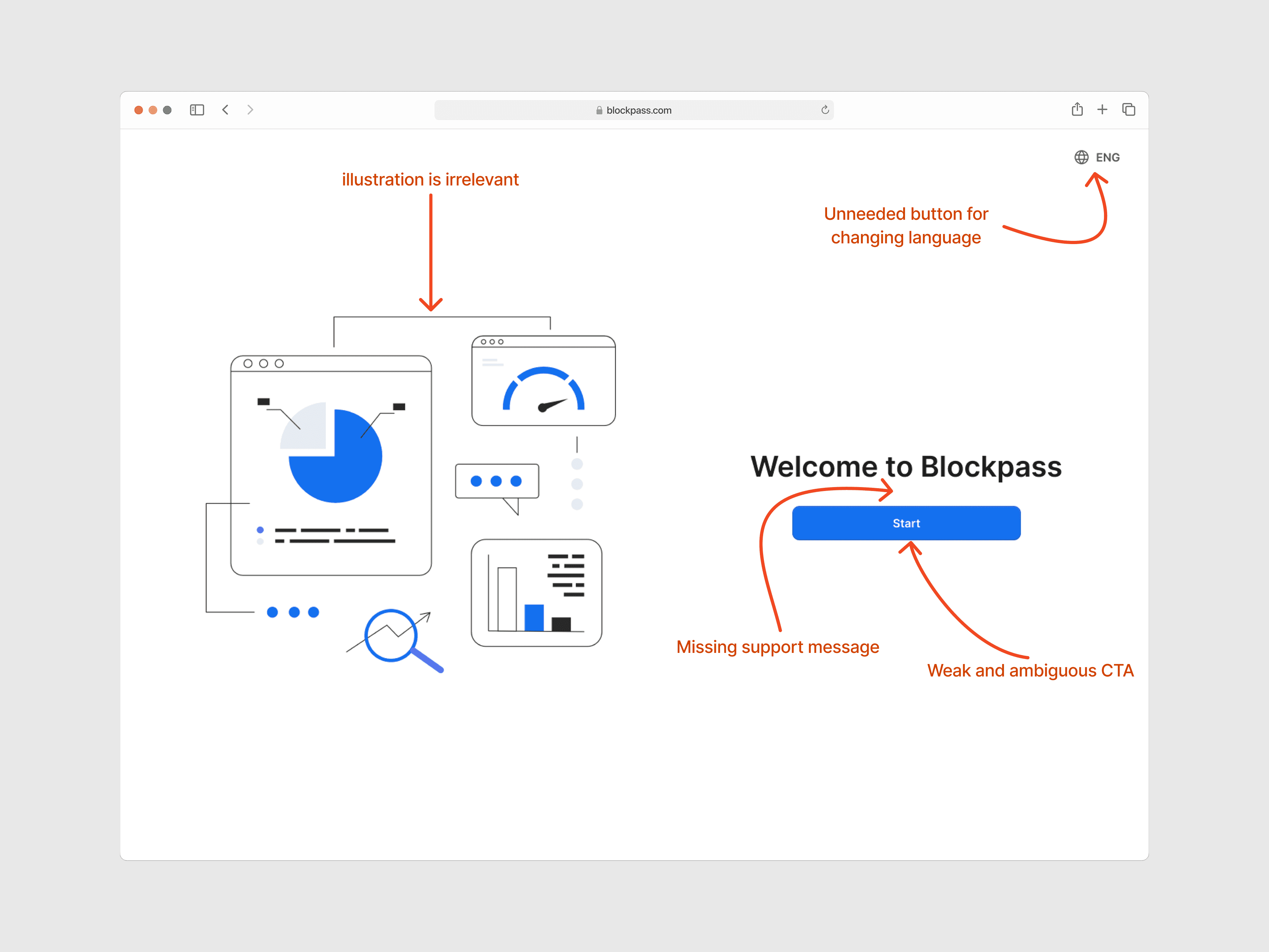
Old welcome screen, with callouts marking the missing value proposition and the ambiguous CTA
Tracing the path to a "dead end"
And even users who clicked "Start" hit a wall. They landed on the Admin Console home page showing an empty-state table: no prompts, no tutorial, no suggested next step. Without direction, users lost the energy to explore the product and take their first actions.

Old home screen, an empty table with no next step
The welcome screen failed to motivate. The home screen failed to guide. Together, they meant the product was dropping users at the exact moment it needed to prove its value.
What the data revealed: billing dashboard analysis
The heuristic evaluation showed what was broken in the experience. To understand why conversion stayed low, I dug into the billing and payment dashboard, focusing on the same two groups behind the ~30% and ~20% baselines above. I wanted to answer one question: "What's stopping them from upgrading?"
The answer was structural. Blockpass's Free plan gave users full access to create KYC services and verify their customers. The Free plan had usage limits, but users could simply create a new account and keep using the service for free. There was nothing pushing them to upgrade. The product wasn't giving users a reason to pay, not because the paid features lacked value, but because users never had to face that value gap.
What the industry revealed: competitive research
Once I understood the problem, I needed direction for the solution. I looked at other identity verification products to see how they onboarded new business users and what data they collected during the process.
Note: Most competing platforms require sales consultations before granting product access. This analysis was based on their public-facing registration flows, marketing pages, and available documentation.
Mapping Blockpass's existing flow
For contrast, Blockpass's existing flow had two parts. Registration collected email → a confirmation code → password → terms agreement → 2FA. Then a welcome screen. That was it. No questions about company size, industry, use case, or expected verification volume.
Comparing competitor approaches
Competitors used two different models, but both shared the same idea: collect user context early to guide them toward the right plan.
Enterprise / sales-led (Jumio, Trulioo, Entrust) required sales consultations before product access, collecting company size, industry, and compliance needs upfront to recommend a tailored plan.
Self-service with guided onboarding (Sumsub, Veriff) let users sign up directly, but asked for company details and a plan selection before granting production access. Free usage was limited to a sandbox with a time-bound trial.
Across both models, competitors shared common patterns: collecting user and company information, asking about specific needs and verification volume, headlines focused on product strengths, and "Trusted by..." sections to build credibility.
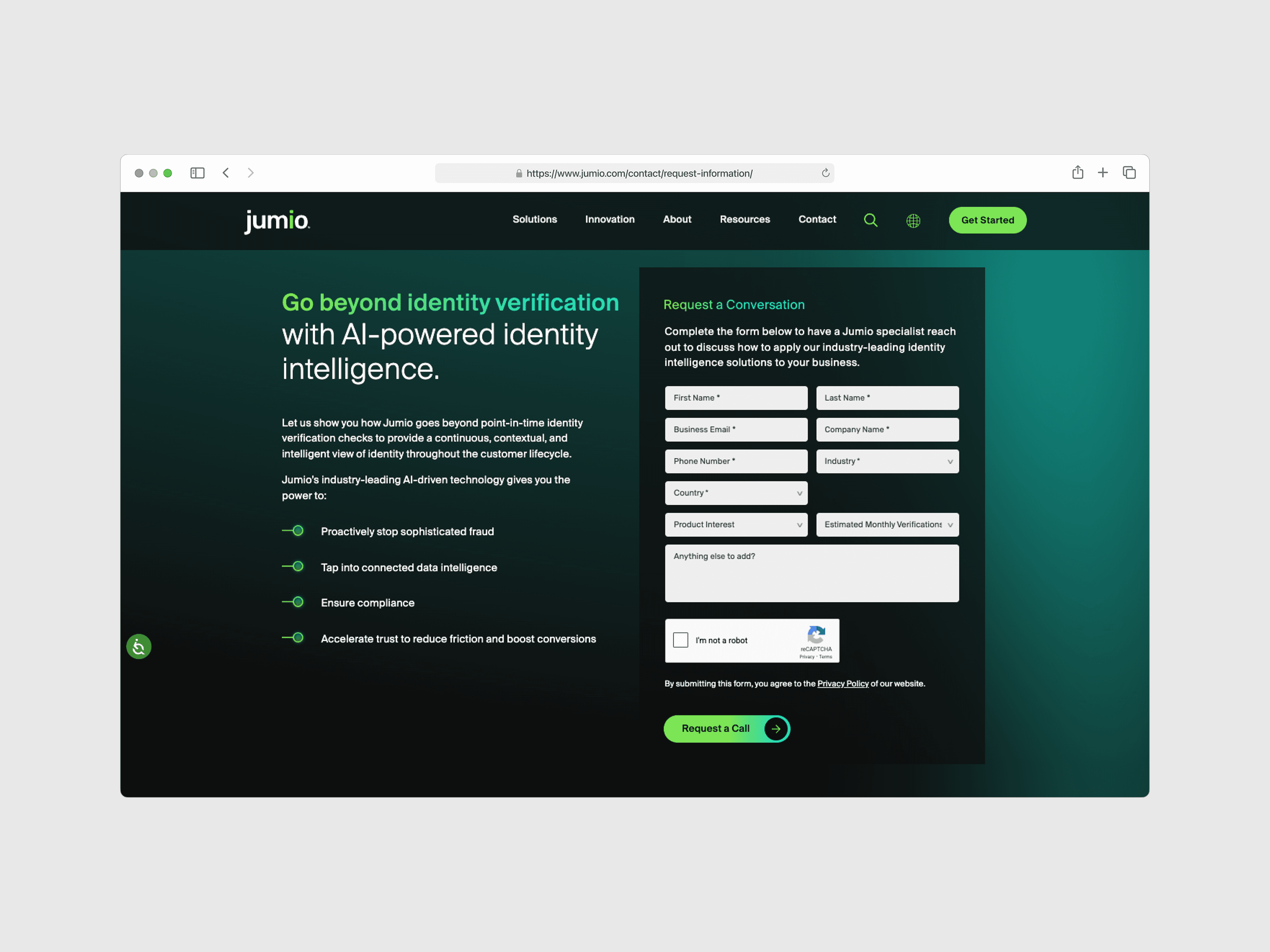
Jumio

Sumsub
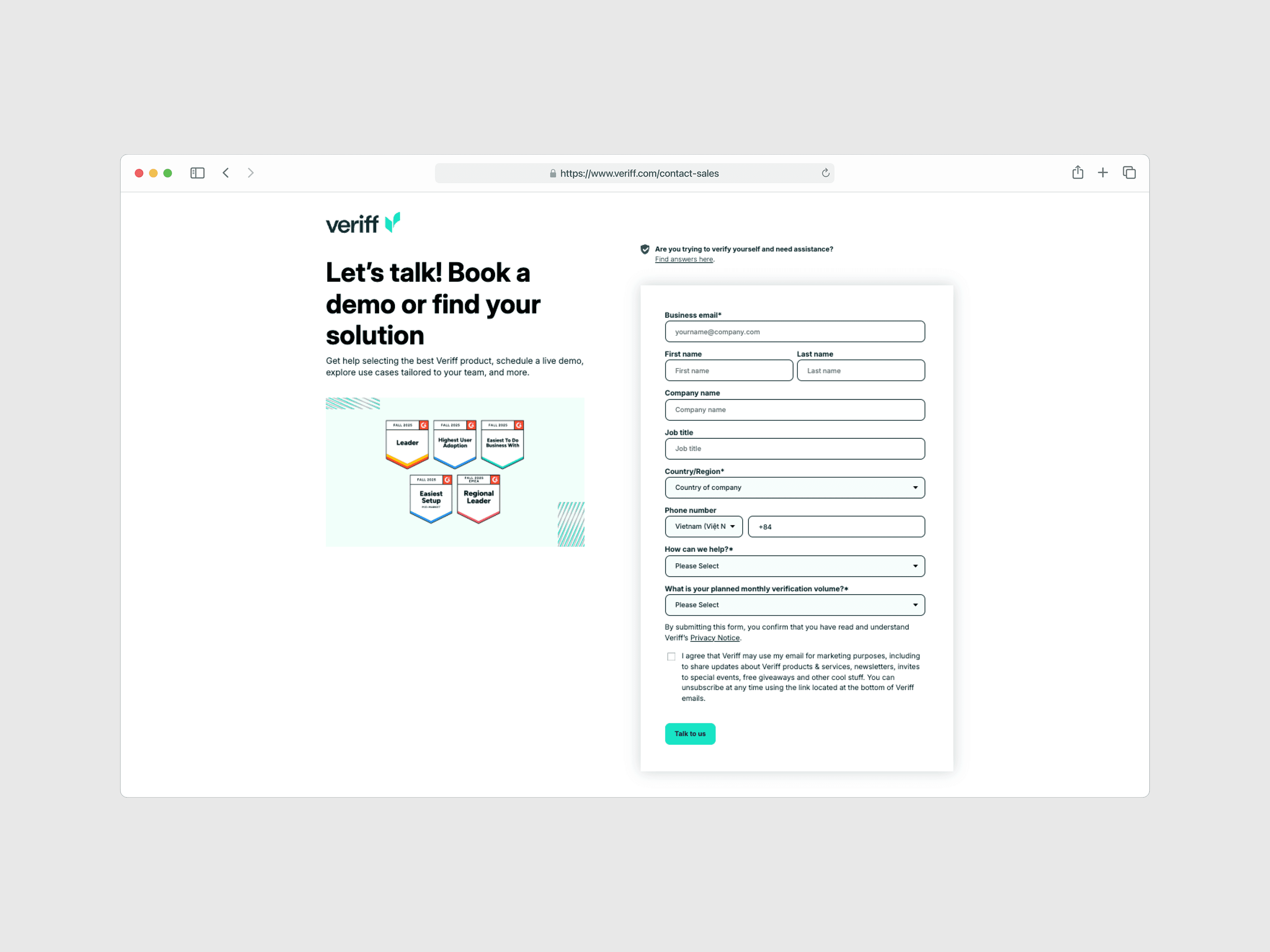
Veriff
In contrast, Blockpass collected nothing beyond email and password. Users went straight to a free plan with full production access. No profiling, no needs assessment, no plan recommendation.
Pulling it all together
The three inputs all pointed to the same thing: Blockpass was doing something no one else in the industry was doing. Every competitor, whether sales-led or self-service, used the first interaction as a chance to understand their customers before granting full access. Blockpass skipped this step entirely. That simplicity had helped acquire a large user base during early growth, but it now meant the platform had no foundation for personalized plan recommendations and nothing to prompt users to consider upgrading.
Hypothesis: To increase conversion among free-plan users, Blockpass needed an onboarding strategy that captures user data and needs early on, enabling personalized plan recommendations while still preserving the benefit of a free tier.
This hypothesis led to a three-stage framework that guided every design decision after: Capture needs → Show value → Guide action.
Design Approach
One thing worth being clear about first: the account-cycling loophole itself couldn't be closed by design alone. Limiting duplicate accounts is an engineering and policy problem, and it sat outside the Billing V5 scope. What design could do was make the value gap visible from the first session: capture each user's needs early, then show exactly what a paid plan would do for those needs, so upgrading becomes the easier path rather than creating another account.
With constraints this tight, I couldn't afford to explore many directions. Each decision had to be backed by what the research already told me and validated through sprint reviews with the CTO and PM. Three decisions shaped the solution.
Decision 1: A multi-step onboarding survey, not progressive profiling
Blockpass's registration collected zero user context. I considered collecting data gradually over time (progressive profiling), but dropped it: the best chance to convert users is during onboarding, before they settle into the free plan. Waiting to collect context would mean waiting to upgrade them.
The survey had two jobs: collect user needs and business information to enable personalized plan recommendations, and reduce friction by using simple, familiar question patterns similar to competitors' flows. The idea wasn't to copy competitors, but to use patterns users already expect so they feel confident from the first step.
Decision 2: A personalized paywall, not a generic pricing page
Users weren't seeing the value of paid plans because they never had a reason to look. A generic pricing page would have been faster to design, but it would repeat the existing problem: users scanning prices without any frame of reference for their own needs.
Instead, I designed a dynamic paywall that adapts based on the user's survey responses. It shows users that Blockpass understands what they need and presents a clear upgrade path based on their answers. It also keeps the free plan available, which gives users a sense of ownership and makes them more likely to upgrade later (Endowment Effect). By recommending a plan based on what users just told us, the upgrade path feels helpful rather than pushy.
Decision 3: A visual checklist on the home screen, not a tooltip tour
The old home screen was a dead end with no next step. Tooltip tours are quick to build, but users usually dismiss and forget them. A persistent visual checklist stays visible until users complete the core actions, giving them direction from the start. It helps first-time users get going, reduces support tickets from confused first-timers, and builds momentum toward completing core actions (Zeigarnik Effect).
5. Final Design
Information Architecture & User Flow
I mapped the full journey first, from sign-up through the onboarding survey, paywall, and into the home screen, to make sure each step connected logically and that the personalized recommendations had the data they needed at the right moment. That upfront mapping also surfaced sequencing problems early, before they became layout problems in Figma.

Information Architecture & User flow to mapped out the end-to-end journey
Onboarding Survey
The first three steps collect business information and service preferences: company details, the services users are looking for, and their expected verification volume. The questions mirror what competitors ask, so the flow feels familiar to business users signing up for this category of product. Each step asks one thing at a time to keep cognitive load low and completion high.
The last two steps, plan selection and billing, are where the survey answers pay off. That's the personalized paywall, covered next.

Steps 1–3, collecting business information and service preferences
The Personalized Paywall: from answers to recommendation
This is the center of the whole hypothesis, so it deserves a closer look.

Steps 4 & 5: the Pricing & Plans step highlights the recommended plan based on the user's survey answers, with a detailed feature comparison below; the billing step closes the flow with an order summary
The recommendation is driven by the user's survey answers: which services they need and their expected monthly verification volume. Each combination maps to the plan tier that fits it, and the paywall presents that plan first, next to a full feature comparison so users can verify the recommendation instead of just trusting it.
The free plan stays visible as an option. Keeping it there preserves the sense of ownership users already have, and it keeps the recommendation feeling like "based on what you told us, this plan fits" instead of "pay now."
New Home Screen
The new home screen replaces the old empty table with two things: a Getting-Started checklist that guides first-time users through the setup steps, and an at-a-glance overview of their applicant data. Users arriving after onboarding know exactly what to do next, which closes the "dead end" identified in the heuristic evaluation.

New home screen with the Getting-Started checklist and applicant data overview
Results & Impact
Before this project, Blockpass had no onboarding flow, no way to understand user needs, and no upgrade path in the product. The redesign addressed all three gaps: a structured onboarding survey, a personalized paywall, and a guided home screen. I owned the design end-to-end, from research through final handoff, delivering ~40 screens over two months.
What Shipped
After I left, the team brought the Plan & Pricing page, upgrade and downgrade flows, free plan cases, and the new Home screen with the Getting-Started checklist into production. The onboarding survey flow hasn't been implemented yet; the company entered a restructuring phase that shifted priorities. Due to NDA constraints, I can't share post-launch metrics.
What I can say is this: a product that used to drop users into an empty dashboard with no direction now has a clear path from sign-up to plan selection. That's the foundation the conversion problem needed.
Collaboration
I worked closely with the CTO and PM on goals and metrics, with developers on feasibility and GA tracking, and with the Ops team on recurring customer pain points that shaped onboarding priorities. With no other designers on the team, sprint reviews were my main feedback loop, so I got resourceful with what I had: behavioral data from the billing dashboard, competitors' public flows, and Ops feedback.
Next Steps I Left Behind
I didn't just hand off screens. I left the team with an iteration playbook tied to each KPI:
If onboarding completion drops below 70%: review step-by-step drop-off data. The most likely candidates are the needs survey or the paywall step.
If free-to-paid conversion doesn't improve: revisit the plan recommendation logic and survey-to-plan matching.
If support tickets stay high: reorder or expand the Getting-Started checklist based on Ops team feedback.
Reflection
What worked
Using data I already had access to, including the billing dashboard, competitor public flows, and Ops team feedback about recurring customer pain points, was the right call given the constraints. It wasn't a replacement for real user research, but it was enough to back up the design decisions with evidence instead of opinions.
What I’d do differently
The core assumption behind this project, that collecting user needs during onboarding would lead to good plan recommendations, was never validated with real users. The survey-to-plan matching logic was shaped by competitive patterns and stakeholder input, which gave it a solid foundation but not certainty. If I could redo this, I'd push to run usability testing on the onboarding prototype before handoff, specifically on whether the survey captured the right signals for plan matching. No amount of competitive research can replace watching real users go through it.
What I learned as a sole designer
Being the only designer across 6+ products forced me to be careful about where to spend design effort. This project taught me that the biggest risk isn't making the wrong design choice, it's spending weeks on a choice that hasn't been tested. Next time, I'll protect time for at least one round of prototype testing, even if it means shipping fewer screens. A leaner scope with validated assumptions beats a polished design built on guesswork.
